

Three circular logos that use white and one other colour. I particularly like the Pizza Express logo as it projects an elegant image for the company and yet also manages to be playful (the swirls as strands of melted cheese?)


Two more colourful yet still simple designs for Penguin and Apple. I think these two logos are also subtly playful. I love the placement of the eye in the penguin, and he bite out of the apple was inspired. It made an obvious symbol immediately unique and distinctive. And if you thought that was clever . . .

Very simple, clever idea for the Food Writers' Guild.
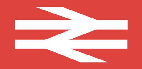
A famous logo for British Rail that still impresses. Like the Pizza Express logo it very simply expresses the essence of the organisation.

Love this. Very elegant, Art Nouveau inspired design. Also a good use of colour - black and gold give it a luxurious feel.


Finally, a really underrated logo. I used to devour Picador books as a student so this might be pure subjectivity creeping in but I love the spacing, typeface and lines framing the typography. Simple logo that was perfect as a stamp of quality.
No comments:
Post a Comment