It seems that the more I do of the course the more I get into it and enjoy it. I was worried that typography would be a bit geeky and dull but it was a real education and eye-opener. I'd always thought the world had enough typefaces and, although this might still be true, I've learnt the importance of a good typeface and the subtle but important variations that may exist between similar-looking typefaces.
The exercise 'playing with words' was great fun and gave me an insight into how much variation you can get just from messing amount with the shape of letters and words. I have also started to look much more closely at the typefaces surrounding me, on book, magazine and CD covers to shop fronts, food packaging and menus.
Exercises such as the magazine cover mock ups, flyers and analyses of newspaper layouts not only made me look more closely at how the different typographical and graphic elements interact, but how difficult it is balancing a range of elements to create an aesthetically pleasing design. The assignment brought all this into sharp focus.
Moving into the final section I'm looking forward to exploring an aspect of graphic design I still feel I'm a bit weak on - layout. I hope to draw all of the elements I've learnt so far together. With the last foundation in place I will start to work on the ideas and projects I've been jotting down over the past year or so. This should give me a strong portfolio which will be essential as I start to look for work in the New Year.
Thursday 27 October 2011
Monday 24 October 2011
I'm Looking Through You
My fourth assignment had two elements. Firstly, to design the font for use on the cover of a magazine called 'Type' and create a mock up of the magazine cover. And secondly, to write a short article for the same magazine, including sections on what makes typefaces interesting, how a typeface is constructed, and question marks.


I was starting to settle on a large slab serif for the background with a more decorative, modern typeface across the front. I then started to think about the mechanics of type, and the people buying the magazine's relationship with type and felt it would be good to get a keyboard or keys onto the cover. I played with a few ideas and felt that using the keys of an old typewriter making up the word 'magazine' would look good beneath the main title.


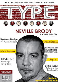


For the title font, I wanted something that appealed to the widest audience and reflected the whole scope of the magazine. The feel I was trying to get was both modern and classic and initially I struggled to see how I could incorporate both into one typeface without it looking messy. I started to sketch a few ideas and started thinking about fusing two typefaces together.


I had the basic of the typeface and it was then a matter of filling in the other elements of the cover. I started to move my designs onto the computer and went with a banner across the top to start with - something I'd noticed and liked in other publications. Century Gothic Bold seemed to work best and, given the number of typefaces on the cover, decided to use it for other elements of information (bar code, price, etc). As I started to work on the main title I started to adapt and customise it. I started with the basic slab of sans serif font (Arial Black) and thought it would look more dynamic if I ran it off the edge of the page so that it had a more dynamic flow. The 'T'was easy and I went with the middle stroke of the 'E' as this is the last to be written by hand. To maintain the feel I merged the 'T' with the 'Y' and extended the 'P' into the 'Y'.
At this stage I realised that I had to make a decision about where the emphasis was going to be. I felt a black/dark cover would be too much so I worked from the basics of a white cover. Thinking about how the font would fit into this I had the idea of a background of words spelling out the font they were written in. This would create a background on which the lighter slab serif font would sit - on top of which would lay a final, darker decorative font.
The final, decorative font chose itself. I initially thought about using a spray/graffiti effect but after trying numerous typefaces in capitals I ended up going with the punky effect of Bradley Hand Regular. I pulled around the elements, overlapping them and moving the middle line of the 'E' out off the page. I also pulled the tail of the 'Y' down through the typewriter keys leading the eye towards the rest of the composition.
It was then just a case of adding the other elements of the cover. I wanted to go with a strong central image, ideally a photograph, to draw the potential reader in and to balance all the type. I found a good black and white photograph of Neville Brody and placed this centrally beneath the title. Filling in the other elements around the central image was fun. I tried not to overload the cover. Where I was featuring a text in an article, I tried to use it. For the other, regular features I initially used Viner Hand Regular.
Although I was initially pleased with my first cover (below) on reflection I felt there was too much going on in terms of colour and decided to tone it down. Although I wanted the magazine to stand out I felt I was relying too much on colour to achieve this.

I removed the yellow edging from around the title, letting the white slab serif run off the page as originally intended. I also felt the black type was a bit heavy and changed it to silver which seemed to work better with the other elements and also seemed to bring out the background lettering behind it. I changed the letter 'N' in 'magazine' to cream and the bar code area from cream to silver.
For me, the crucial changes were made around the main photograph. In the yellow regular feature banners I ran them behind the main photograph which looked less messy and drew the eye into the central image. I also changed the typeface from Viner Hand to Bradley Hand Regular, made them the same colour and increased the stroke width. I also switched the other feature banners to one colour, black, and linked the main headline to the title by switching it to the same colour. I feel the overall image is now much stronger and more integrated as a result of these subtle changes in colour. I am also pleasantly surprised by the way the switch of the colour in the decorative 'TYPE' from black to silver actually makes it stand out more and at the same time is less overwhelming!

After reading over the brief for the inside article my initial thought was to start with a letter on the background of the page and for a while used 'g'. This was changed only when I reached the question mark article and realised that a question mark would make a perfect background image.

I wanted to use a range of typefaces and, as I wrote the first article, a sans serif font seemed most appropriate - mainly because I was talking about how interesting they could be! I was also aware that the second piece was about the elements of a typeface and may best served by using a more decorative serif font, thereby allowing me to contrast the two.
As I worked through the article it seemed fairly obvious to illustrate typefaces by using them as I wrote about them. I decided on Myriad Pro Regular for the main text and to revisit Century Gothic Bold for the heading to give the magazine (and assignment) an overall 'feel'. I was also aware of the need for colour and went with a red which contrasted nicely with the greys, blacks and yellows already on the page.
At this stage I also decided to have the name of the magazine across the top of the page and a page number at the bottom. I was playing around with a few typefaces when I hit on the idea of having a line between each letter. I went with the idea and employed the same typeface I'd used for the heading and banner on the cover, Century Gothic Bold. I played around with the type area and decided to sketch out an idea of how I wanted the three pieces arranged on the page. Here the exercise analysing newspapers proved invaluable and i was keen to use the curves of the background character and space to the full.

The anatomy of a typeface provided more of a challenge as I realised that it could get very 'bitty' having lots of different parts of letters across the page. I wanted to avoid this as I was keen to keep fairly close to the page layout I'd sketched out (above). As I came to the first letter that needed to be displayed I decided to simply make it large and incorporate it into the text. I was still aware of the need to maintain interest and decided to highlighted the key terms I was talking about in red. I thought a splash of yellow was needed and used this for the baseline and x-height illustrations. I'm pleased that the article manages to discuss the main elements of a typeface and illustrate them so succinctly. It made me appreciate the demands made on graphic designers when having to get a lot of information into a small area. I think the Times New Roman Regular typeface worked well as the main text, as did the Bold version for the headline, and both contrast nicely with the typefaces sandwiching them.

The final article was entitled 'question mark'. I had already decided on the layout of the page and so the piece had to be succinct. This allowed me to use a less regular font. I wanted a contrast with Times New Roman and settled on Berlin Sans, a great looking typeface, for the headline (bold) and main text (Regular). As I wrote the first sentence, just getting thoughts out on question marks, I had the idea of a row of questions marks and the idea of a competition suggested itself immediately. I feel I managed to display a good range of typefaces in the article and that the overall composition works well together.
Subscribe to:
Posts (Atom)