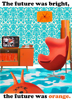
After some thought I decided to go with the colour orange. I wanted to work with a positive, bright colour but felt that red and yellow may result in me lapsing into fairly obvious thought patterns, whereas orange seemed a lot more challenging and original. The other reason I chose orange was that, when I think about my early childhood (in the seventies), it is the colour that most vividly evokes those memories and that time.
To make it more personal - and with the importance of utilising the skills from this module - I decided to go with the idea of a poster recreating a seventies living room.
Initially I had thought about trying to use just orange white and black but when I looked at the colour wheel I realised there was a great opportunity to use another colour that featured heavily in my childhood, teal. I started to collect images - an orange egg chair, lamp, sideboard, clock, penguin books and television. Finding teal wallpaper was much more difficult and I ended up having to use a single sample four times - matching it up was almost as difficult as the real thing! I found a small sample a teal carpet and used the perspective tool to create the right perspective looking into the poster. The white skirting naturally suggested itself as a border between the two patterns.
Positioning the objects was great fun. It initially looked quite staged and at that point I then decided to put a mug next to the chair to add some warmth - I also added more penguin books next to the television, with the final piece added being the space hopper looming in the foreground slightly sinisterly. In the early drafts I went with a still from 'Tales of the Unexpected' on the television as it met the criteria in terms of colour and memories. However, it didn't draw me into the composition enough so I searched for an image of Johan Cruyff - the personification of seventies orange. By sheer good luck the image was of him playing against West Germany (who played in black and white). I had to paint orange over some of the figures in the crowd and used the blur tool to blend them in. The (recently discovered) blur tool was vital for this assignment. I'd discovered it doing the Newsnight exercise and it really helped the object look natural and part of the same composition.
I tried a few versions, including one where I went with my original thoughts of using black, white and orange only (below).
I thought I'd settled on the final version with the composition below:
But I then started to play around with canvas size. I really liked the slightly dreamlike feel I was achieving but felt it was missing something. Suddenly the tag from the original Orange mobile launch from the mid-nineties popped into my head and I added it to the composition, increasing the size of the text below to tie in with the perspective.
A bit of final tinkering resulted in the final image (below) which I feel used the best aspects of the three versions. I liked the slightly wistful feel of the text, evoking the happy, slightly naive optimism of the seventies.


No comments:
Post a Comment